Primary typeface
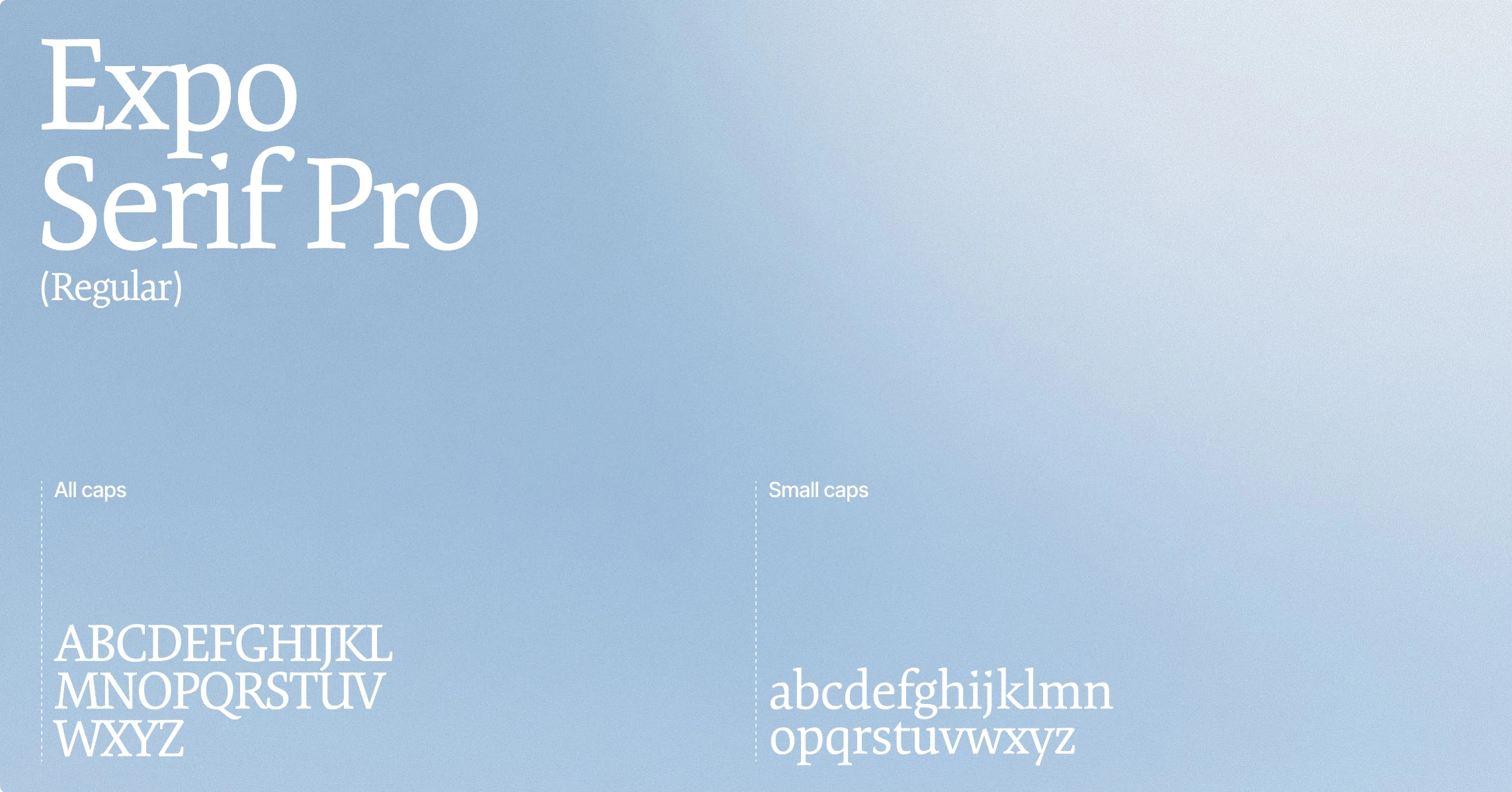
Expo Serif Pro is used for brand-led headlines, statements, and moments that need emphasis. Its refined serif form gives Langga a sense of confidence, care, and precision without feeling cold.

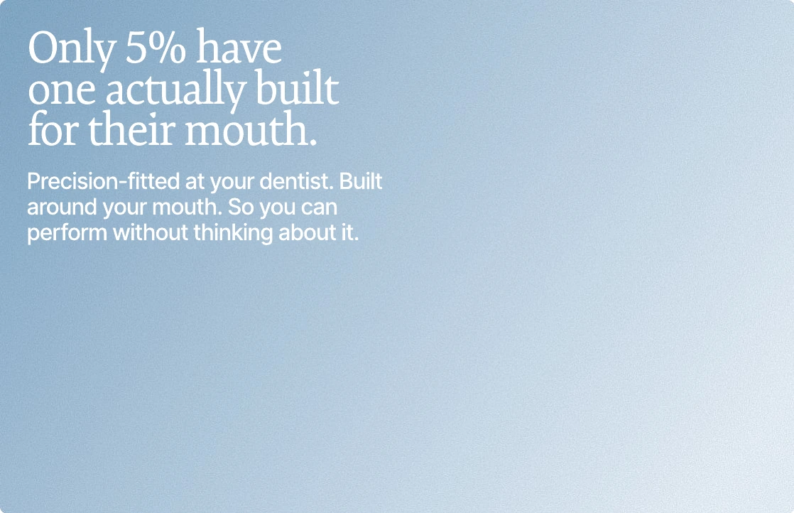
Langga’s typography balances clinical confidence with human warmth. Serif headlines bring precision, focus, and premium character, while clean sans-serif bodycopy keeps every message clear, direct, and easy to understand.

Expo Serif Pro is used for brand-led headlines, statements, and moments that need emphasis. Its refined serif form gives Langga a sense of confidence, care, and precision without feeling cold.
Inter Tight is used for supporting copy, product information, captions, and functional details. It keeps the brand clear, legible, and grounded across both digital and physical applications.

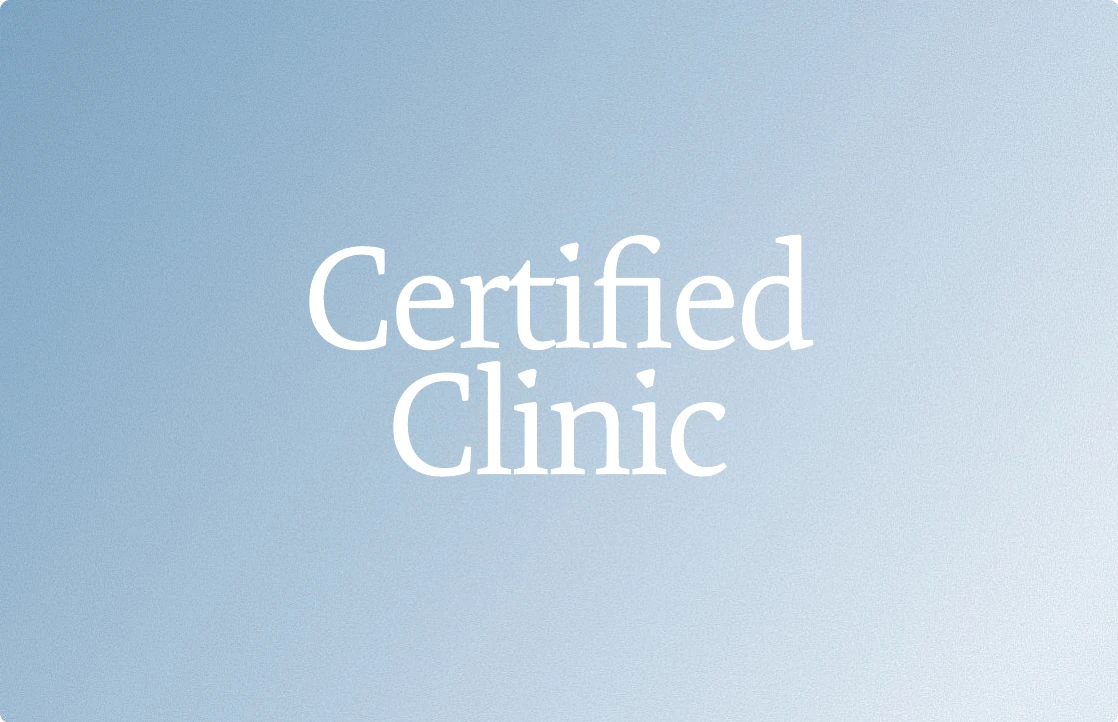
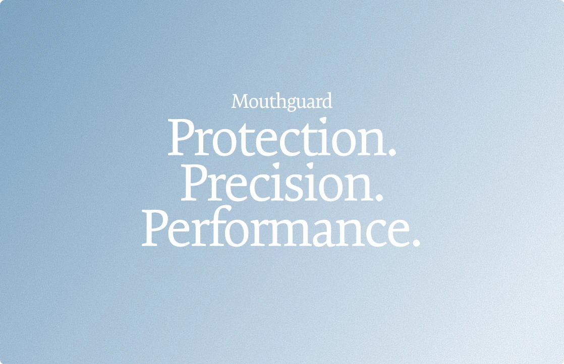
Text lockups should feel calm, spacious, and intentional. Use them to highlight Langga’s key messages — from clinical trust to performance protection — without overcrowding the layout.


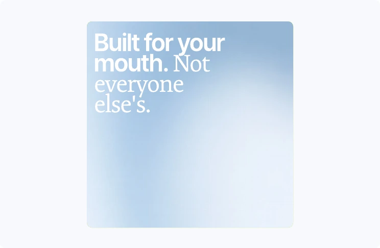
Don’t mix together both primary and secondary font in one line.

Don’t cut off the text.
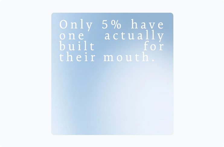
Don’t justify or increase the letter spacing.