
Logo
The Langga logo is calm, precise, and confidently simple. Its rounded wordmark reflects the brand’s approach to protection — fitted, considered, and built around the individual. Use it with clarity and restraint so it always feels premium, clinical, and easy to recognise.
Colour versions
The logo may appear in white or navy, depending on the background. Use the white logo on Frost Gradient or dark navy applications, and the navy logo on light backgrounds to maintain strong contrast and legibility.
Size and borders
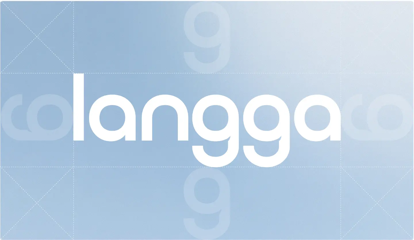
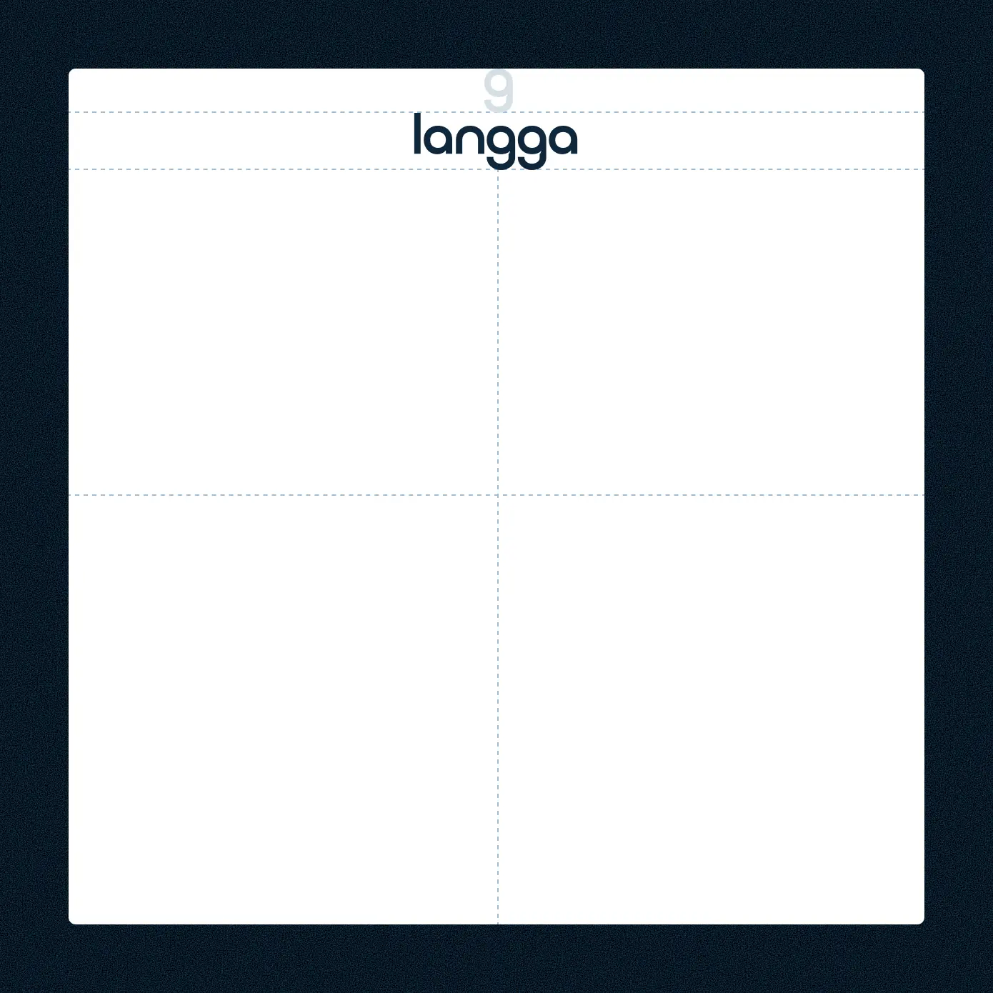
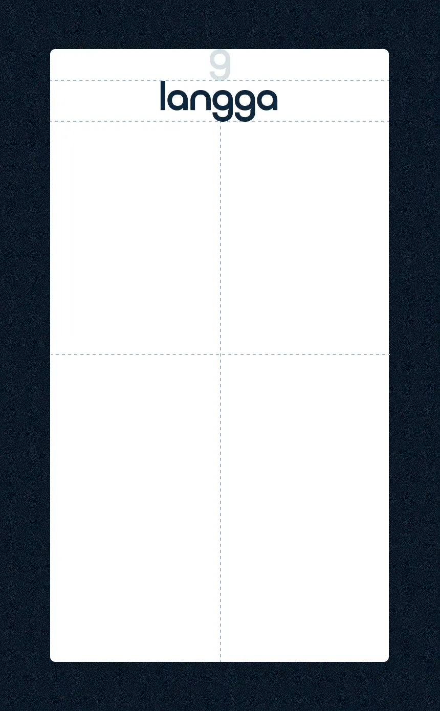
Give the logo enough clear space to breathe. It should never feel crowded, stretched, or forced into a layout. Keep the surrounding space clean so the brand mark remains precise and easy to read.
Print — 6mm high
Digital — 40px high
Positions
Place the logo where it feels calm and intentional. It can sit centrally for brand-led layouts, or in the corner for supporting applications. Always keep it aligned, balanced, and surrounded by enough space.
Things to avoid
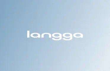
Don’t stretch, distort the logo.

Don’t rotate the logo.
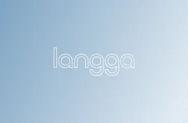
Don’t outline the logo.

Don’t use dark logo on colour background.

Don’t apply drop shadow on the logo.
Don’t apply gradient on the logo.